Client
The Scissorkicks
Services
Brand, Marketing, Website design, Website development
Overview
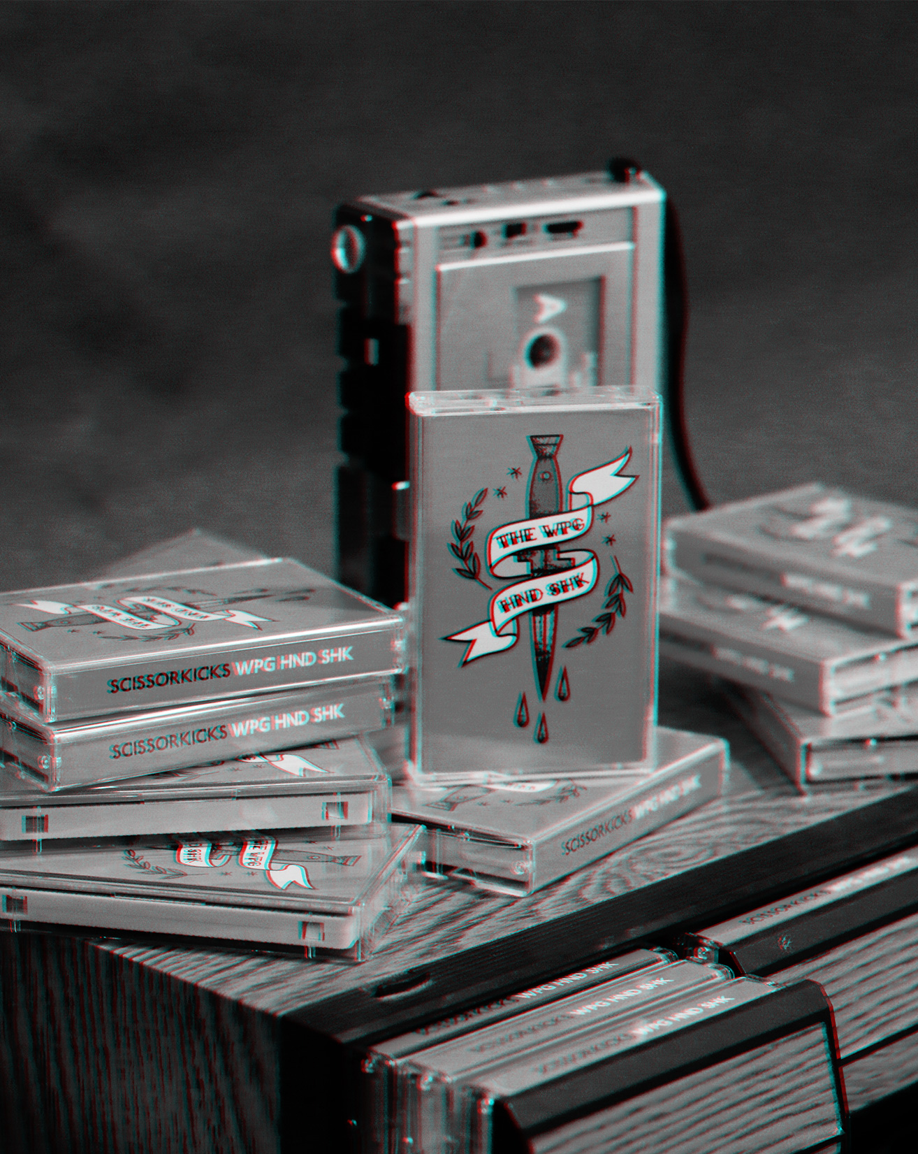
The Scissorkicks are a folk/rock band located here in Cleveland. They focus on capturing live charm over polished and rehearsed sounds. They came to us in need of a cassette design and a website to mirror their lofi concept. This was a super fun project and we learned a ton about tangiblility. Stamps, stickers and spray paint piecing these babies together.
About the brand.
The Scissorkicks Wordmark was made with P22 Underground Heavy. We chose it because it scales down really well. For the album cover art we did a Sailor Jerry style illustration with the album name (The Winnipeg Handshake) faux-abbreviated, “The Wpg Hnd Shk”. The Website and other elements followed the theme of knives.
Mine Shaft
R33 G33 B33
C72 M66 Y65 K73
Tuscany
R198 G76 B44
C16 M83 Y96 K5
Noteworthy.
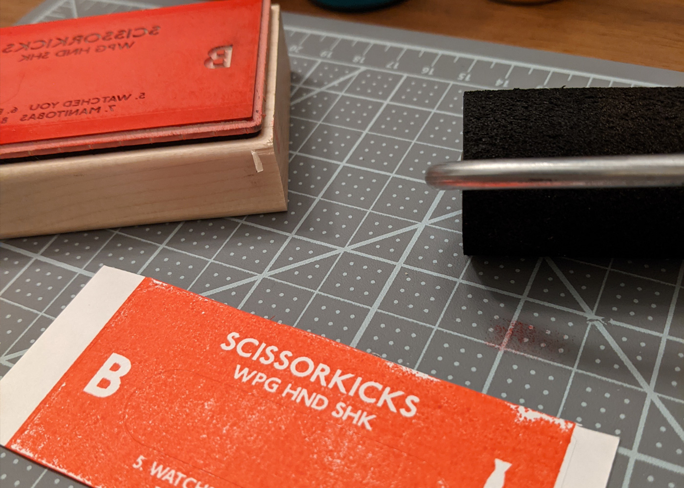
For the cassette labels, we designed simple rubber stamps sized to the label and manually stamped every A and B side and placed them on every cassette.
We're in. Are you in?
If you like what you've seen, please head over to the contact page and let's try to make something wonderful.
Let's do this